10 Years. I was there for nearly every day but it still seems kind of insane that it’s been over a decade since we launched Sactown. Perhaps it’s because its a bimonthly, so the relatively smaller number of issues (we’re currently in the mid-60s) makes the timeline feel more condensed. Whatever it is, it’s been a long, strange, trip. And other overused cliches as well.
In November 2005, I was miserable working for a now-defunct Sacramento glossy that I will attempt to be charitable by not mentioning by name. My girlfriend at the time knew this and kept trying to get me to put myself out there and actively find something better. That something better came in the form of a Craigslist ad she found about a Sacramento magazine startup that was looking for an art director. There was only one problem: the ad was from the Bay Area Craigslist. (To cast a wide net, they had placed ads both in Sacramento and San Francisco.)
Surely they were looking for a superstar. Someone with a name and an armload of awards under it. So naturally I demurred to save myself the embarrassment. She pressed me on the issue so I responded to the ad, mostly just to get her to stop bothering me about it. Fortunately, they were interested in meeting with me.
It was quite a process. I met with the founders Rob Turner and Elyssa Lee several times in their home and chopped up our different philosophies of what could make a new city mag in Sac work. We agreed that the city was coming into its own culturally (a prediction that has since proved itself accurate) and it needed a book that reflected that. A modern guide to a modern Sacramento. And thus, Sactown was born.
But first, I would have to jump through a few hoops. In spite of having built up a pretty sturdy showbook of publication work and redesigns by that point, they would still need to run me through a few spec tests to see what I could do with content a bit more specific to the model they had in mind. For the first time ever, I am going to show these publicly in spite of them being very overdesigned as they were the act of a desperate lad eager to show off every trick and style he had in the quiver. These arent great, but they give you an idea of what we were up to a year before the first issue hit the streets. You’ve been warned…
 November 2005 design tests for the job of art directing Sactown magazine.
Ouch. Very 2005 and a bit all over the place. Kinda bubbling over with too many ideas but in the end I guess they were able to see through that to the potential in the bones of the work. Of course, none of these ideas would really end up surviving into the first issue, but it was enough to show them that we were all pointed more or less in the same direction. Over the Christmas holiday they made me an offer and once the new year started, so would we.
We need a logo
In their initial work feeling out the market, the founders commissioned Fuel Creative Group to put together some spec designs to show around and prime the ground for the arrival of a new mag, and the midtown-based firm created a logo based on Clarendon Medium, with a bit of flourish at the tail end on the “n,” using an upside-down “u” to produce a unique serif version of the last letter.
![]() Fuel Creative’s original logo concept for Sactown magazine. 2005.
Fuel Creative’s original logo concept for Sactown magazine. 2005.
I liked the initial logo, but I wanted to add more twists to it, so I dropped it into Illustrator, beefed up the silhouette with a stroke a couple tenths of a point thick, brought the characters closer together giving them a more graphic ligature, and locked the forms together with a cutout brace in the middle.
![]()
Several variants which were in the running to be the original Sactown logo.
![]()
The initial logo for Sactown magazine at launch in 2006.
I also added a second flavor to the mix in the form of ITC’s Conduit font, which would prove to be indispensable those first couple years. A modern, clean, sturdy font that played its role quietly while also hinting at sophistication without commanding too much attention. For the basic color palette I chose a (very-mid-aughts) smart maroon and burnt red/brown to give the logo an earthy-yet-urban feel. We had our flag and colors to fly on our initial promo materials.
Stationery and Media Kits
A vitally important part of introducing ourselves to the world was our media kit. Since there was no magazine yet, the kit needed to be much more than a folder with our logo, a letter from the publisher, and a rate sheet. This was a shot across the bow of our market and we wanted it to be heard as clearly as possible. Thus, I went full on arts-and-crafts with it, creating an elaborate full-color package of tabbed cards (that I cut by hand) all designed to work together as a piece visually. To be honest, they were a bit of a nightmare on a practical level to design, print, assemble, etc but they looked great and were very impressive. Lots of relationships Sactown has to this day began with that kit.
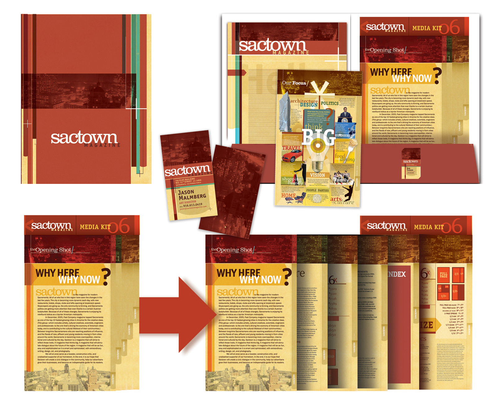 The very first Sactown media kit: Spring 2006
Mock-Ups
So now we need to show people the magazine that does not yet exist. How to sell something that isn’t yet a thing? We need to both generate excitement and also be true to what the book ultimately will be. We’d start with some covers. Most of what would happen inside the book visually would follow the lead of the cover anyway. At this point we were still nailing down exactly what departments would feature in each issue, so tackling the cover design would not only help us lay down some basic style rules but also help to inspire what the inside would ultimately look and feel like. Some of these rules would survive intact and some in spirit in the final published book but the important thing was they set the right tone. With this relatively small step Sactown became real in a way it hadn’t before that. For us as well as everyone awaiting its arrival. We even had fun with it, inventing an “it girl” ingenue in the form of mock-up cover star (and now long-running inside joke) Glory Adams.
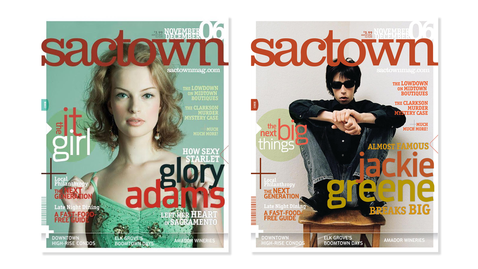 Glory Adams and Jackie Greene: one we totally made-up and the other a future Sactown cover star.
We tried a lot of crazy things with those mockups: the transparent gradient under cover footer lines, the obnoxiously large issue date, arrows and plus signs all over, that bar code that might have worked(?) but two crucial elements to our early identity are there and they would survive the initial design process well into the first few years of the magazine: the white half-inch border framing the cover photo to give the magazine overall the feel of an art or coffee table book, and the issue number tab running vertically up the left hand side. I fought for that tab and the reasoning behind it: by making serialization of each issue an overt part of the design we are both suggesting that this is something to be collected and that it is more important than the usual glossy mag you toss out at the end of the month. This was something maybe you’d want to keep. In fact, we not only wanted to position ourself apart from other glossies but we in fact would not be a glossy altogether.
From the start, we all agreed that matte was where we wanted to be. A smart matte finish, satin even. Heavy paper with a substantial tactile weight and feel. No small detail, we would spend much of June and July handling blank bound volumes with our eyes closed to feel-test different paper stocks, weights, finishes, and UV coatings against each other. We wanted a magazine that could take heavy ink flood without fluting, that could reproduce photos beautifully, and that would feel important in your hands. Part of the reader’s experience would be tactile and we wanted to be sure not to neglect that.
Establishing Type
We now had some traction. We had a visual spirit to work with. Next, we would need to assemble our players. Im a fan of classic type. What I saw Sactown‘s voice being was a kind of classic modern. I wanted to create a modern look that pushed some edges here and there, but that felt analog in its execution. A 2006 look that could have been created with 1966 tools. I would ground my color palette in earthy browns and reds and slates and cobalts. The color palette for that first year was never so much regimented as it was simply understood. We knew from inception that we were gong to lean heavily on gorgeous widescreen photography. The design would need to buttress where possible, supplement where able, and augment when needed. I aimed for a look that could make great photography shine brighter and (god forbid we ever got any) offer bad photography a crutch. We were extremely fortunate to never have to deal with the latter. In fact we’ve suffered from—if anything—an embarrassment of photographic riches since day one. Our shooters would become as much part of the DNA of Sactown‘s look as any font or masthead. And our type stable at launch was no slouch. We’d lean primarily on three typefaces: Emigre‘s Eidetic Neo, a semi-severe bit of serif that blurs the lines between body and display in a way that I think worked well for the voice we needed to project coming out of the gate. MetroSac was a custom face I had Frankenstein’d together in Fontographer when I realized I was never going to find a sans as cool as what Details was using at the time, and to square things off, a reliable condensed that I had relied on as a go-to for years: Din Schrift, a sturdy utility font strong enough to quietly take a backseat and play support to its two siblings. We had our type stable.
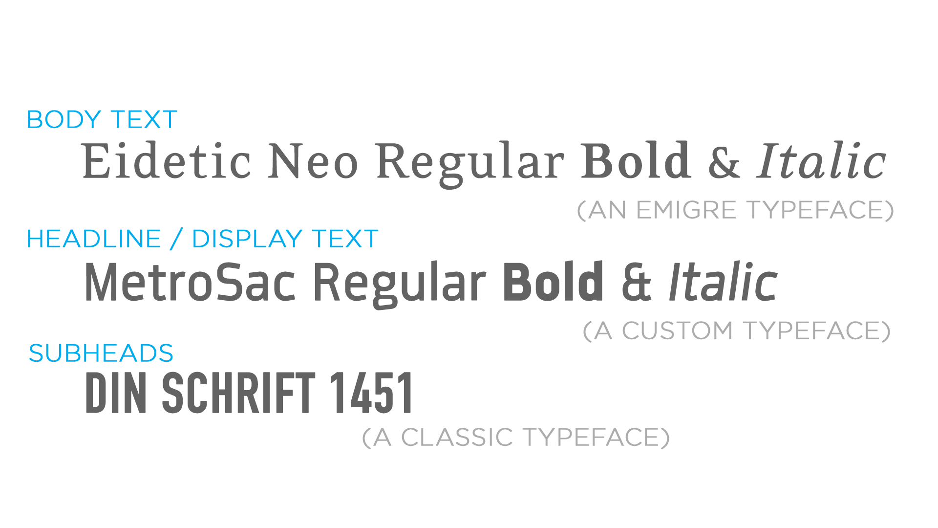
The initial typestack Sactown launched with in 2006.
Adding texture and detail
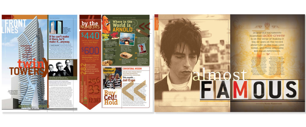
Sactown needed to be a different kind of city mag. I wanted you to know before you read a single word that you were dealing with a different personality with a different voice. I eschewed the mid-aughts’ rediscovery of Swiss minimalism in favor of a kind of maximalism on the page. I took some cues from web-style information architecture and melded them with the limitations of print. Side-strips of simple navigation appeared under your thumb on every editorial page you went to. I color coded departments with simple tabs to give readers their bearings and a sense of place even if they didn’t know they were. The templates were constructed from spanning headlines in colors and sizes emphasizing different facets of the story, balanced against cantilevered deks, sleek hairlines, subway-map arrows leading you through sections, and unorthodox elements like paper textures in the margins. Rounded story lead-in arrows would slide into place to guide the eye in. Every page needed to feel alive and its presentation an active companion to the text it presented. I wanted something that felt a bit more interactive than just text and image delivery, and it felt in 2006 like readers were ready for that as well. The result of this was a book that didn’t really look like anything else out there at the time.
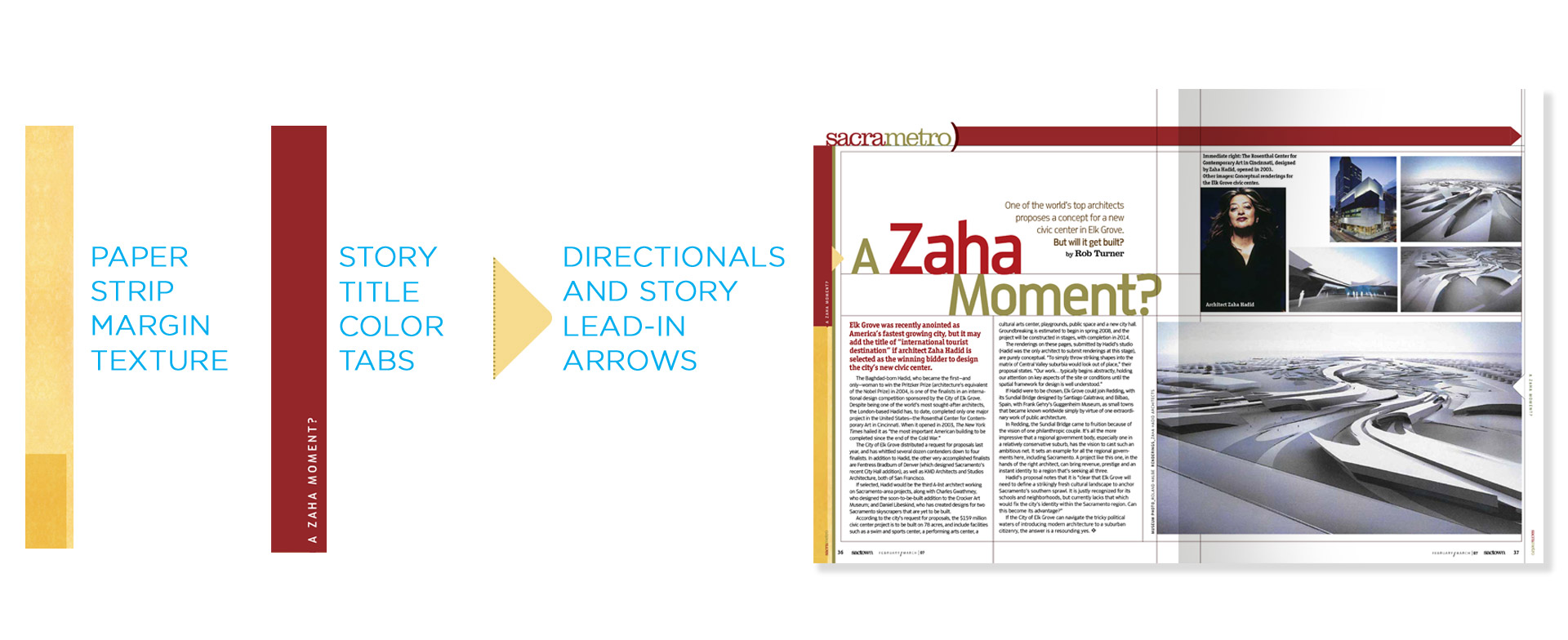 An early spread for a story on renowned architect Zaha Hadid.
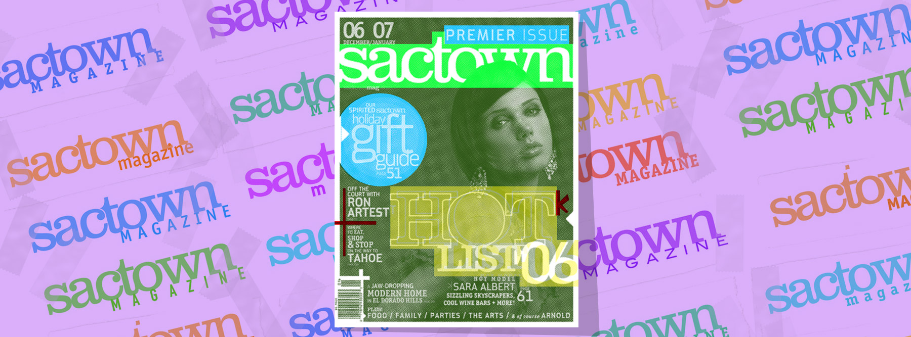
Issue One: Premier not Premiere
The first issue of any magazine is always simultaneously the easiest and the hardest. Easiest because you’ve essentially had your entire life to decide what’s going into it and hardest because everything you’re doing you’re doing for the first time, reliant on methods, infrastructure, and protocols that are all getting tested for the very first time. The run to the finish line for that first issue (dubbed our “Premier” issue, in a stroke of grammatical correctness that baffled everyone that had been using the secondary spelling of the word as an adjective for years) was as hard as anything we’ve had to tackle since. We quite literally worked night and day (and the next night again) on Issue #1. We went to a sporting goods store and bought inflatable mats to keep behind our desks so we could switch off and do 90 minute slingshot naps to keep us rolling through it all. I was emptying my office trashcan twice as often as it filled up endlessly with spent energy drink cans. It was such a content-rich issue—and we were such a skeleton crew— that we ended up going to press a few weeks later than was ideal but in the end we made it up the hill. Issue One of Sactown came out around Thanksgiving 2006, fully 11 months after I came aboard. It made a huge splash and set a very high bar that we’ve only improved on since.
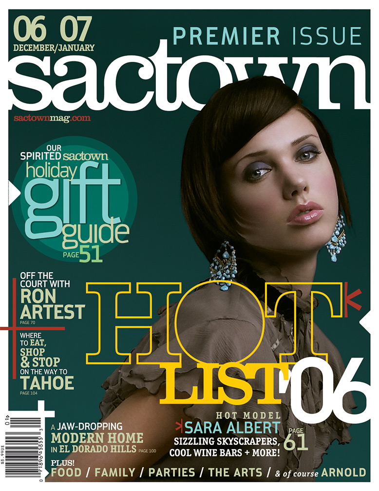
The cover of Sactown‘s premier issue. November 2006.